Галерея ИИ-промптов OpenZhenZhen · gpt-image-2.5 · image
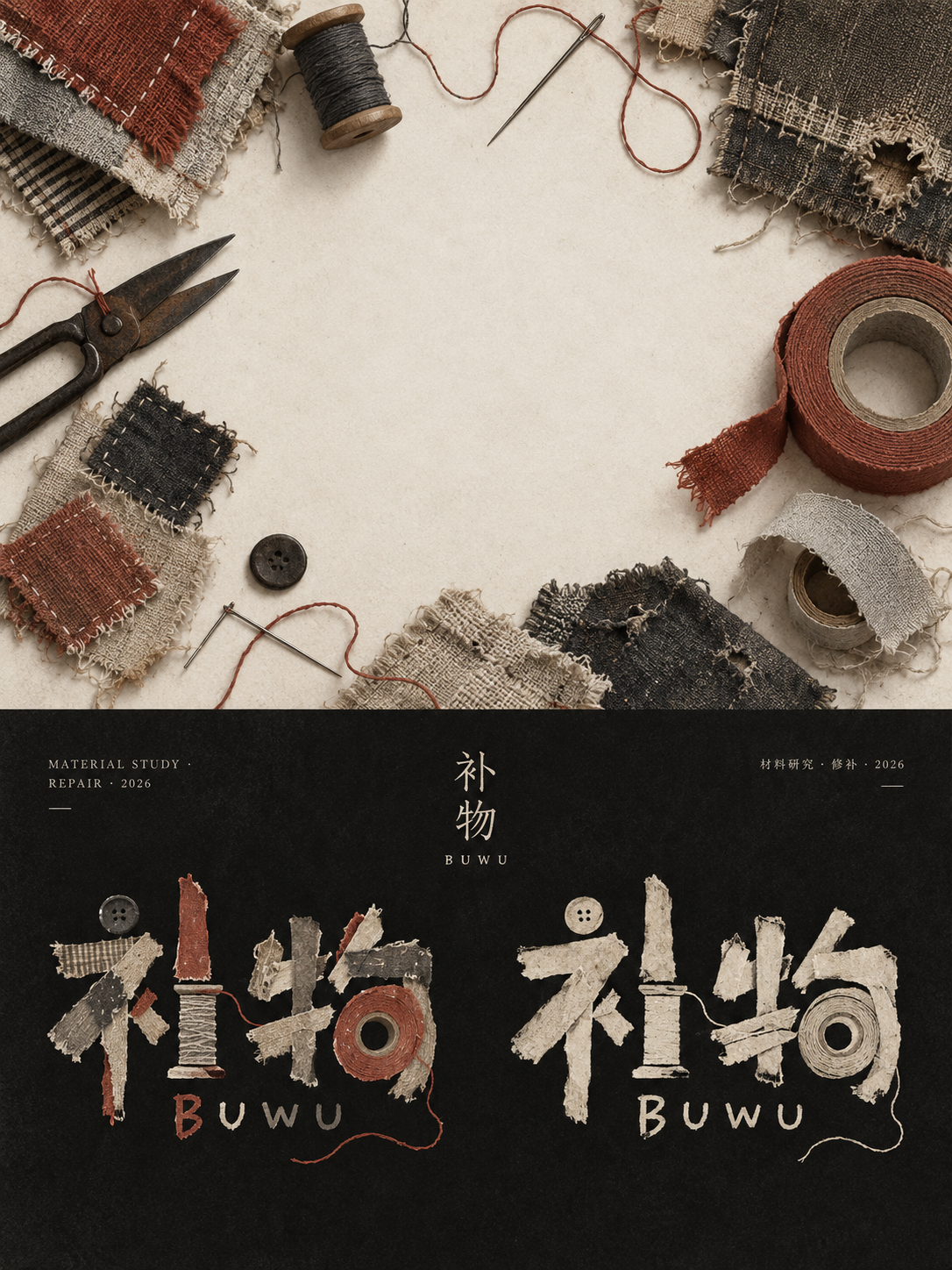
Визуальная доска в ремесленном стиле для бренда ремонта старинных вещей
Vintage Repair Brand Handcrafted Style Vision Board
«Визуальная доска в ремесленном стиле для бренда ремонта старинных вещей» — работа с использованием gpt-image-2.5 на OpenZhenZhen. Изучите исходный промпт и пример генерации для собственных проектов.
Промпт
Промпт на китайском
为旧物与旧衣修补材料品牌(英文对照:an old-object and garment repair-materials brand)创作一张竖版3:4手作品牌视觉风格板。整体按明度强烈分成上下两区。上半部是干净的高明度空场,留出安静留白;以俯视方式陈列补丁布、针线、修补胶带和磨损的布料边角(英文对照:patch cloth, needles and thread, repair tape, and worn fabric corners),采用近似圆环的聚拢构图,中间留出安静空白(英文对照:a near-circular gathered composition with a quiet open center)的构图。让长条、圆端、尖端和弯曲轮廓提供可提炼的符号线索。保留手工痕迹、磨损边、暗部擦亮、细小裂纹或涂层剥落,并使用柔软贴地的阴影;空白面积应大于实物占用。 以砖红色(英文对照:brick red)作为唯一低饱和强调色。大面积结构使用暖象牙色、哑黑和灰褐色,材质保持粗粝无光泽。下半部转为哑黑信息场,顶部只放少量极小字距的说明文字,左右边角形成轻微对称,中轴放窄长竖排品牌标题。展示中文品牌名“补物”及小号英文转写“BUWU”;加入微小辅助文字“材料研究 · 修补 · 2026”(英文原文:MATERIAL STUDY · REPAIR · 2026),信息层级从标题到注释逐级收缩,并保持充足留白。 主要标志从上部物件轮廓中提炼,不直接照搬实物:把长柄、圆端、凹口、缺角和连接处转化为松散手写字母与幼拙图形。字母大小不齐、基线略有跳动、间距舒展,局部字形可被器物状剪影替代,像手剪纸片或厚涂颜料贴在黑底上。并置彩色版与浅色版时,保持相同字形骨架。避免精致矢量效果、商业光泽、整齐网格、无意义文字、随机标语、虚假坐标、额外徽标和水印;清楚呈现粗粝手作、材料磨耗、图形与文字彼此变形的关系。
Промпт на английском
Create a vertical 3:4 handmade brand visual style board for an old-object and garment repair-materials brand (Chinese reference: 旧物与旧衣修补材料品牌). Divide the layout strongly by brightness. The upper half is a clean, high-brightness field with ample quiet negative space; show patch cloth, needles and thread, repair tape, and worn fabric corners (Chinese reference: 补丁布、针线、修补胶带和磨损的布料边角) in an overhead display, arranged as a near-circular gathered composition with a quiet open center (Chinese reference: 近似圆环的聚拢构图,中间留出安静空白). Let long strips, round ends, tips and curved silhouettes provide extractable symbolic clues. Keep handmade traces, worn edges, polished dark areas, small cracks or peeling coatings, and soft grounded shadows; the blank area should outweigh the objects. Use brick red (Chinese reference: 砖红色) as the only low-saturation accent. Build the large color fields from warm ivory, matte black and gray-brown; keep the materials coarse and lusterless. Transition the lower half into a matte-black information field. Put only a little tiny explanatory copy near the top, slight symmetry at the left and right corners, and a short vertical brand title on the center axis. Set the Chinese brand name “补物” with its small English transcription “BUWU”; add tiny supporting copy “MATERIAL STUDY · REPAIR · 2026” (Chinese reference: 材料研究 · 修补 · 2026), with the hierarchy shrinking toward the annotations. Preserve generous negative space. Derive the main logo from the upper objects' contours rather than copying an object literally: transform handles, round ends, notches, missing corners and joints into loose handwritten letters and primitive graphics. Vary letter sizes, let the baseline jump and spacing breathe, and replace a few glyphs with object-like silhouettes, as if made from hand-cut paper or thick paint stickers on black. Juxtapose a color version and a light version using the same underlying glyph skeleton. Avoid polished vector finish, commercial gloss, neat grids, meaningless text, random slogans, fake coordinates, extra logos and watermarks. Keep the relationship between rough handmade materials, wear, letters and graphics visibly interwoven.
Больше промптов для изображений и видео · Создать изображение · Создать видео · Создать на ИИ-холсте
Похожие работы
- zzcovF
«zzcovF» — работа с использованием gpt-image-2.5 на OpenZhenZhen. Изучите исходный промпт и пример генерации для собственных проектов.
- zzcovE
«zzcovE» — работа с использованием gpt-image-2.5 на OpenZhenZhen. Изучите исходный промпт и пример генерации для собственных проектов.
- Ретро-кафе: редакционный постер в пиксельной мозаике
«Ретро-кафе: редакционный постер в пиксельной мозаике» — работа с использованием gpt-image-2.5 на OpenZhenZhen. Изучите исходный промпт и пример генерации для собственных проектов.
- Плакат «Холодная роса»: абстрактная текущая вода
«Плакат «Холодная роса»: абстрактная текущая вода» — работа с использованием gpt-image-2.5 на OpenZhenZhen. Изучите исходный промпт и пример генерации для собственных проектов.
- Профильный портрет взрослой женщины в синем платье с цветами, сидящей на каменном краю клумбы в тени
«Профильный портрет взрослой женщины в синем платье с цветами, сидящей на каменном краю клумбы в тени» — работа с использованием gpt-image-2.5 на OpenZhenZhen. Изучите исходный промпт и пример генерации для собственных проектов.
- Крупный план покраски талии, ног и каблуков-пистолетов смоляной фигурки Байонетты
«Крупный план покраски талии, ног и каблуков-пистолетов смоляной фигурки Байонетты» — работа с использованием gpt-image-2.5 на OpenZhenZhen. Изучите исходный промпт и пример генерации для собственных проектов.