OpenZhenZhen AI 提示词画廊 · gpt-image-2.5 · image
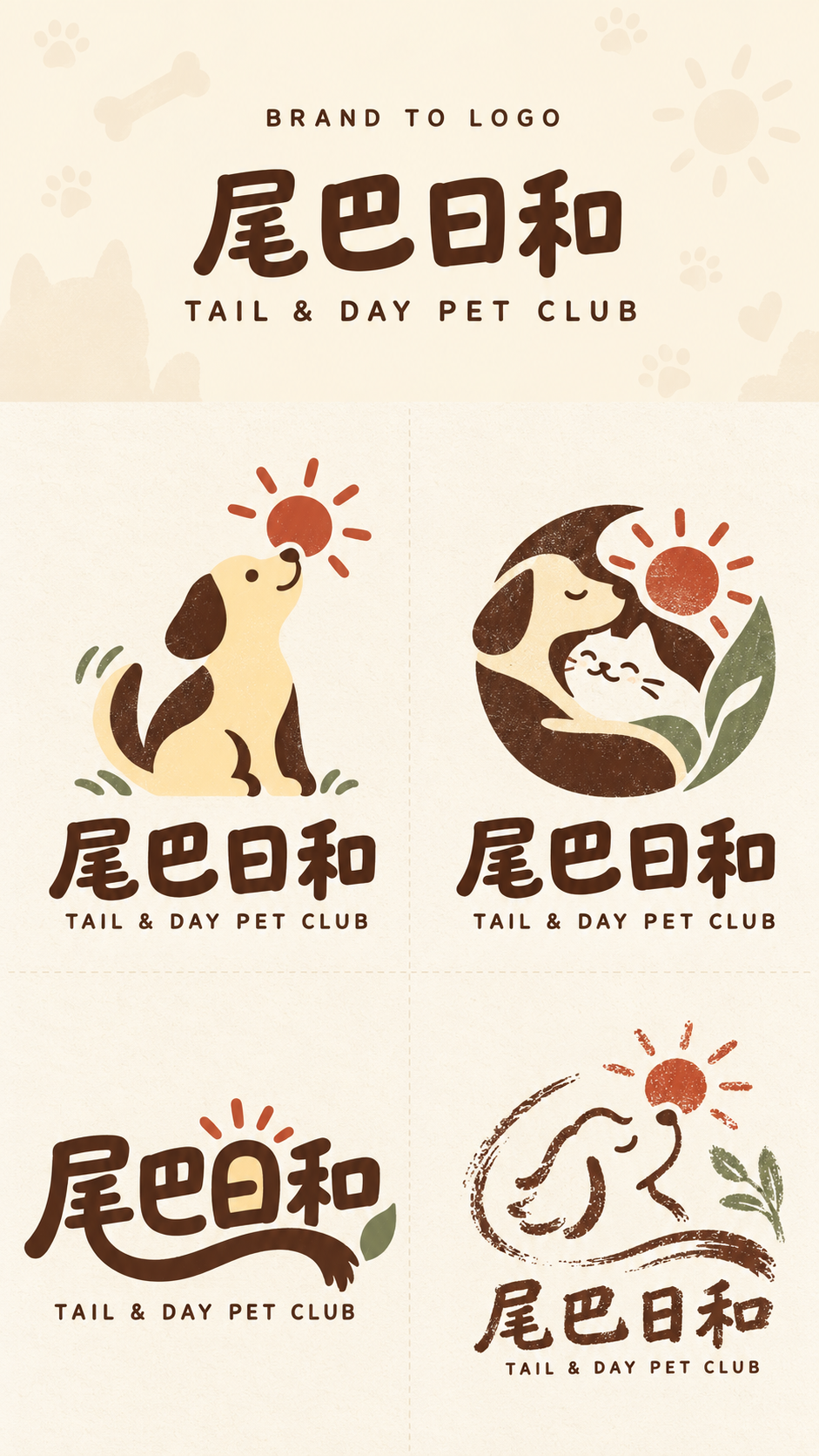
四路品牌标志概念探索版式
Four-Way Brand Logo Concept Layout Exploration
固定9:16竖幅品牌探索稿:上方30%展示品牌输入,下方70%以2×2等分呈现吉祥物、意象徽章、字形创意和开放式手作印记四种不同Logo路线。
提示词 / Prompt
中文提示词
为尾巴日和(英文名称:TAIL & DAY PET CLUB)创作一张专业的竖幅9:16“Brand to Logo”概念探索稿。品牌类型:宠物生活方式品牌 / Pet lifestyle brand。品牌关键词:温暖、自然、亲切、手作感 / Warm, natural, friendly, handmade feel。核心视觉意象:尾巴、太阳、宠物陪伴 / Tail, sun, pet companionship。主色建议:奶油黄、深棕、砖红、鼠尾草绿 / Cream yellow, dark brown, brick red, sage green。 版式:顶部品牌输入区严格占画面高度30%,下方Logo探索区严格占70%,不得改变比例;名称较长时缩小字号。顶部是信息引入,不是主视觉海报。使用暖米白底色与低对比宠物主题暗纹 / Warm cream ground with subtle low-contrast pet motifs,仅添加与品牌相关的低对比细微纹理。顶部只呈现三层信息:小标题“BRAND TO LOGO”、中文品牌名尾巴日和、英文品牌名TAIL & DAY PET CLUB。两种名称均用清晰现代的普通印刷字体,不预先设计成Logo。顶部不要口号、说明、编号、印章、额外图标或密集小字。 下方70%使用带极淡纸纹的暖象牙色纸面,以浅细虚线严格划分为2×2四个等大区域,不画外围边框。四个方案围绕相同的品牌类型、关键词、核心意象与1–3色配色展开,但设计方法必须一眼可辨地不同。每格都呈现可实际应用的完整Logo标识系统,包含中文品牌字标和较小的英文名称,适用于招牌、包装、标签、社交头像与名片;不要做成海报、完整插画或样机。 第1格|吉祥物:从宠物生活方式含义中提炼高度概括的动物或拟人化标志,形成易记的清晰轮廓,并让吉祥物与核心意象有明确联系;避免复杂人物或场景。搭配中英文品牌字标。 第2格|意象徽章:将两至三个核心视觉元素融合为紧凑、平衡的单一徽章。利用负空间、环绕、叠合或形状共融,使其成为统一标志,而非并排的小图标。搭配中英文品牌字标。 第3格|字形创意:以尾巴日和和/或TAIL & DAY PET CLUB本身为主要设计对象,将核心意象融入字母或汉字的笔画、结构、字形与负空间,同时保持名称易读。不要在普通字体旁放置一个分离图标。 第4格|开放式手作印记:以手刻、版画或店铺印记为灵感,使用开放弧线、不完整边界、自然笔触与克制的缺墨不匀感。不要使用完整方框或封闭椭圆。保持主次清楚、留白充足,并包含中英文品牌字标。 配色仅参考奶油黄、深棕、砖红、鼠尾草绿 / Cream yellow, dark brown, brick red, sage green,每条路线最多使用1–3种主色。四款共享同一品牌世界观,但不能把同一Logo仅换画风或排版重复四次。避免杂乱高饱和色、复杂渐变、3D、金属浮雕、玻璃质感和商业样机。所有字样清楚可辨。不要A/B/C/D编号、口号、底部说明文案、包装样机、门店场景、完整插画、水印或其他额外文字。
English prompt
Create a professional vertical 9:16 “Brand to Logo” concept-exploration sheet for TAIL & DAY PET CLUB (Chinese brand name: 尾巴日和). Brand type: Pet lifestyle brand / 宠物生活方式品牌. Brand keywords: Warm, natural, friendly, handmade feel / 温暖、自然、亲切、手作感. Core imagery: Tail, sun, pet companionship / 尾巴、太阳、宠物陪伴. Suggested palette: Cream yellow, dark brown, brick red, sage green / 奶油黄、深棕、砖红、鼠尾草绿. LAYOUT: The top input area occupies exactly 30% of the full image height and the logo exploration area exactly 70%. Never change this ratio; reduce type size for long names. The top is an introduction, not a poster. Use Warm cream ground with subtle low-contrast pet motifs / 暖米白底色与低对比宠物主题暗纹 with only subtle low-contrast texture related to the brand. Show exactly these three information layers: the small heading “BRAND TO LOGO”, the Chinese brand name 尾巴日和, and the English brand name TAIL & DAY PET CLUB. Render both names as clear modern printed text, not as finished logos. Add no slogan, description, numbers, stamps, extra icons, or dense small copy in the header. In the lower 70%, use warm-ivory paper with very light grain. Divide it into exactly four equal 2×2 quadrants using only faint thin dashed separators; draw no outer border. Develop all four concepts around the same type, keywords, core imagery, and 1–3-color palette, but make their visual methods unmistakably different. Each quadrant is a practical logo identity system with the Chinese wordmark and smaller English name, suitable for signage, packaging, labels, social avatars, and business cards—not a poster, full illustration, or mockup. QUADRANT 1 — MASCOT: Create a highly simplified animal-inspired or anthropomorphic mark derived from the brand's pet-life meaning. Use one memorable silhouette and a clear connection between mascot and core imagery; avoid a complex character or scene. Pair it with both wordmarks. QUADRANT 2 — EMBLEM: Combine two or three core visual elements into one compact, balanced emblem. Use negative space, enclosure, stacking, or shape fusion so the elements form a unified mark rather than adjacent icons. Pair it with both wordmarks. QUADRANT 3 — TYPE-LED: Make 尾巴日和 and/or TAIL & DAY PET CLUB itself the main design object. Integrate the core imagery into letterforms, strokes, structure, or negative space while keeping the names legible. Do not place a detached icon beside ordinary type. QUADRANT 4 — OPEN HANDMADE STAMP: Create a loose hand-carved, printmaking, or shop-stamp identity using open arcs, partial boundaries, natural strokes, and restrained ink irregularity. Do not use a complete square frame or closed ellipse. Maintain clear hierarchy and generous whitespace; include both wordmarks. Use only Cream yellow, dark brown, brick red, sage green / 奶油黄、深棕、砖红、鼠尾草绿 as the palette guidance; keep each route to 1–3 main colors. The four concepts share one brand world but are not one logo repeated in different styles or layouts. Avoid saturated color clutter, complex gradients, 3D, metallic embossing, glass effects, and commercial mockups. Keep all lettering readable. No A/B/C/D numbering, slogans, explanatory copy below, packaging mockups, store scenes, full illustrations, watermark, or extra text.
探索更多图片和视频提示词 · 生成图片 · 生成视频 · 在 AI 画布中创作
相关作品
- 废土末日女战士电影概念全身像
一位明确成年的废土女战士手持带刺铁棍,置身燃烧营地与装甲车之间;以纵向全身构图、琥珀火光和黑橙烟尘塑造电影概念艺术。
- 京都八坂塔复古旅行摄影转水彩海报
以日本京都八坂塔与传统街巷为同一旅行目的地,设计上半写实摄影、下半手绘水彩水粉的复古旅行日志海报。
- 酒红发时尚编辑12机位3×4全身样片
一位明确成年的女性以同一身份呈现于3×4十二格时尚编辑样片中,穿深巧克力棕缎面吊带裙与披肩黑色羊毛大衣;十二个角度展示妆发、服装细节及完整造型。
- 网吧包房游戏陪玩抓拍九宫格
一位成年游戏陪玩在网吧包房中的随手抓拍,以3×3九宫格呈现在竖幅9:16画布上;九格保持同一人物与同一游戏空间的连贯性。
- 凄美中式怪谈女鬼与书生
中式怪谈场景中,明确成年的女鬼坐在头部以旧亚麻布包裹的书生肩上,手持题名为《金瓶梅》的古籍。古寺木雕、青灰香烟与单支烛光构成冷暖交织的暗黑奇幻摄影氛围。
- 右脸局部的真实手机自拍快照
一位成年女性的前置手机自拍只捕捉到右脸与右眼局部、几缕刘海和托腮的手;桌面杂物与暖色台灯、局部过曝和轻微噪点保留随手拍的日常质感。