OpenZhenZhen AI 프롬프트 갤러리 · gpt-image-2.5 · image
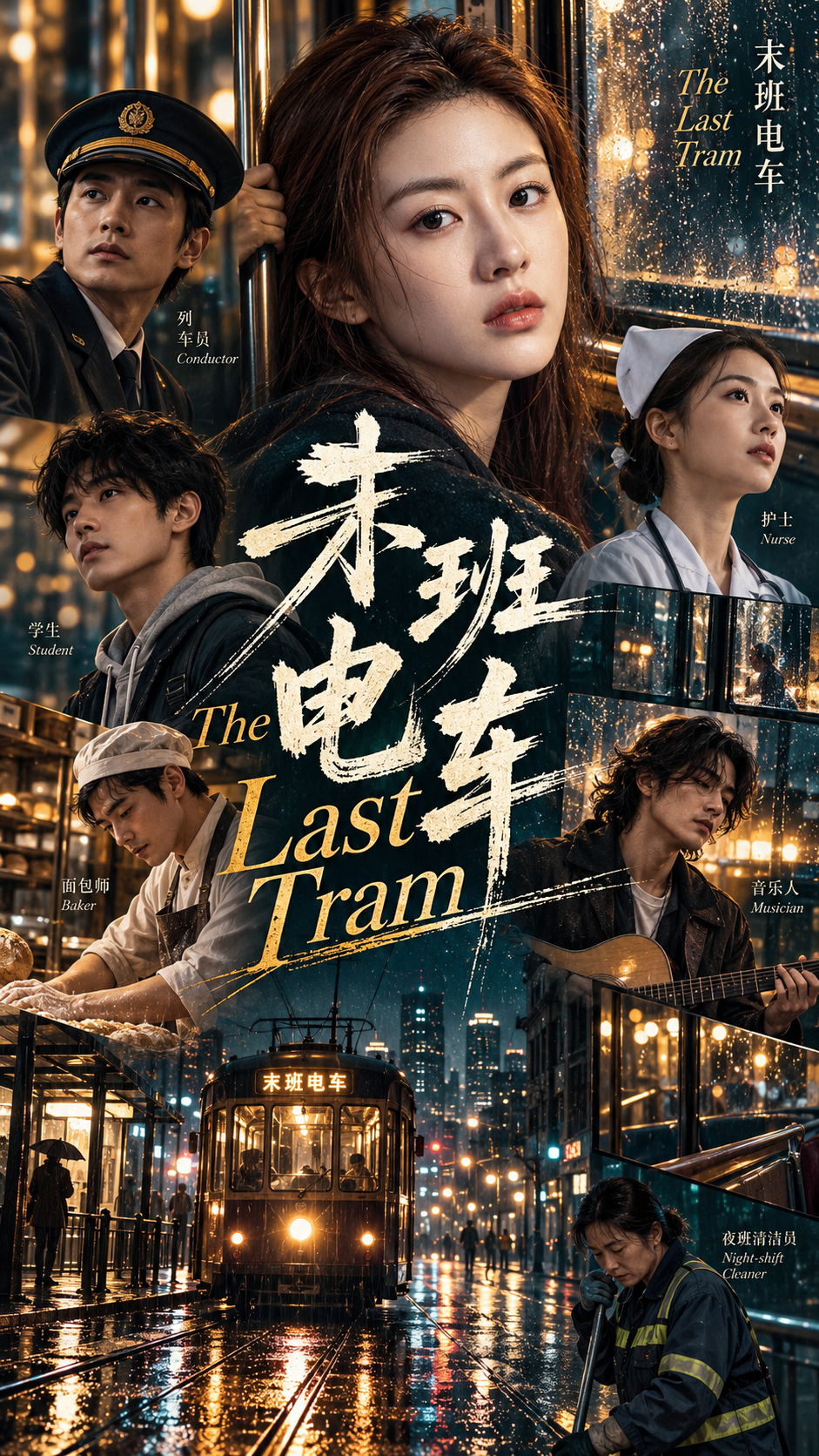
막차 도시 군상 포스터
Last Train City Portrait Poster
‘막차 도시 군상 포스터’은(는) gpt-image-2.5로 만든 작품입니다. OpenZhenZhen에서 원본 프롬프트와 생성 예시를 살펴보고 새로운 창작에 활용해 보세요.
프롬프트
중국어 프롬프트
创作一张高端多人社论海报。 【主题】Stories converging on the last tram of a rainy city / 雨夜末班电车上的城市相逢 【标题】The Last Tram / 末班电车 【人物 / 角色】a conductor, a nurse, a student, a baker, a musician and a night-shift cleaner / 一位列车员、一位护士、一位学生、一位面包师、一位音乐人和一位夜班清洁员(包含5至8位人物) 【主色调】deep teal, warm amber and soft ivory with restrained neutral blacks / 深青色、暖琥珀色与柔和象牙白,辅以克制的中性黑 【海报类型】film / 电影 【纵横比】9:16 围绕刻意不规则的视觉层级构建构图,而非使用整齐网格。采用差异鲜明的肖像比例、超大面部、局部裁切、全身人物、狭窄照片条、微型纪实片段、大胆排版与选择性留白。 避免等大肖像、对称布局、统一边距、卡片式模块、标准网格,以及任何像PowerPoint或Canva套版的效果。整体应经过精心艺术指导但视觉上不拘一格:让图像跨越隐形边界、与文字叠合、突破画框,并形成鲜明的前景与背景关系。 将文字排版作为构图的一部分,而非单纯标签。让大字与人物发生互动、隐入人物身后、横跨照片、占据留白,或成为结构形状。按原样呈现给定标题;其他辅助文字仅保留有意义的姓名、日期、角色、地点或简短背景,不要杜撰标语或填充文案。 严格围绕给定主色调控制色彩,理想情况下使用2至3种主色并辅以中性色。采用写实社论摄影,呈现自然皮肤纹理、彼此可辨的面孔、可信表情和多样姿势。画面包含5至8位符合所给角色的明确成年人,每张脸都应彼此不同,不添加未列出的人物。混合大、中、小及微小视觉元素,形成节奏。 最终效果应像经过专业艺术指导的社论海报:不规则、有层次、高密度、视觉大胆,同时清晰且有意图。保持9:16纵向比例;避免简单可复用的网格或演示文稿套版感。
영어 프롬프트
Create a high-end multi-person editorial poster. 【Theme】Stories converging on the last tram of a rainy city / 雨夜末班电车上的城市相逢 【Title】The Last Tram / 末班电车 【People / roles】a conductor, a nurse, a student, a baker, a musician and a night-shift cleaner / 一位列车员、一位护士、一位学生、一位面包师、一位音乐人和一位夜班清洁员 (include 5–8 characters) 【Main palette】deep teal, warm amber and soft ivory with restrained neutral blacks / 深青色、暖琥珀色与柔和象牙白,辅以克制的中性黑 【Poster type】film / 电影 【Aspect ratio】9:16 Build the composition around intentionally irregular visual hierarchy rather than a clean grid. Use dramatically different portrait scales, oversized faces, partial crops, full-body cutouts, narrow photo strips, small documentary fragments, bold typography and selective negative space. Avoid equal-sized portraits, symmetrical layouts, uniform margins, card-based modules, standard grids, or anything that feels like a PowerPoint or Canva template. Make the layout carefully art-directed but visually unpredictable: let images cross invisible boundaries, overlap typography, break out of frames and create strong foreground/background relationships. Treat typography as part of the composition rather than a label. Let large words interact with people, disappear behind bodies, cut across photos, occupy negative space or become structural shapes. Render the supplied title exactly as written and keep all other supporting copy limited to meaningful names, dates, roles, locations or short context. Do not invent extra slogans or filler text. Keep the supplied palette controlled, ideally with 2–3 dominant colors plus neutrals. Use realistic editorial photography with natural skin texture, distinct faces, believable expressions and varied poses. Include 5–8 clearly adult characters matching the supplied roles; keep every face visually distinct and do not add unlisted people. Mix large, medium, small and tiny visual elements to create rhythm. The final result should feel like a professionally art-directed editorial poster: irregular, layered, high-density and visually bold, but still clear and intentional. Preserve the 9:16 vertical aspect ratio. Avoid a simple reusable grid or presentation-template look.
더 많은 이미지·동영상 프롬프트 보기 · 이미지 생성 · 동영상 생성 · AI 캔버스에서 만들기
관련 작품
- 동방 월영 유광 포스터: 함께 바라봄
‘동방 월영 유광 포스터: 함께 바라봄’은(는) gpt-image-2.5로 만든 작품입니다. OpenZhenZhen에서 원본 프롬프트와 생성 예시를 살펴보고 새로운 창작에 활용해 보세요.
- 도쿄 여행 신문 콜라주: 도시 노트
‘도쿄 여행 신문 콜라주: 도시 노트’은(는) gpt-image-2.5로 만든 작품입니다. OpenZhenZhen에서 원본 프롬프트와 생성 예시를 살펴보고 새로운 창작에 활용해 보세요.
- 패션 매거진 인물 포스터: 형태와 그림자의 거울 구도
‘패션 매거진 인물 포스터: 형태와 그림자의 거울 구도’은(는) gpt-image-2.5로 만든 작품입니다. OpenZhenZhen에서 원본 프롬프트와 생성 예시를 살펴보고 새로운 창작에 활용해 보세요.
- 한 줄기 천 개의 울림: 5단계 농구 점프슛 스트로보 궤적 인포그래픽
‘한 줄기 천 개의 울림: 5단계 농구 점프슛 스트로보 궤적 인포그래픽’은(는) gpt-image-2.5로 만든 작품입니다. OpenZhenZhen에서 원본 프롬프트와 생성 예시를 살펴보고 새로운 창작에 활용해 보세요.
- 두 번째 세계: 베네치아 블루 아워의 초현실 종이 콜라주
‘두 번째 세계: 베네치아 블루 아워의 초현실 종이 콜라주’은(는) gpt-image-2.5로 만든 작품입니다. OpenZhenZhen에서 원본 프롬프트와 생성 예시를 살펴보고 새로운 창작에 활용해 보세요.
- 홍루몽 임대옥 장화, 동양 선의 미니멀 포스터
‘홍루몽 임대옥 장화, 동양 선의 미니멀 포스터’은(는) gpt-image-2.5로 만든 작품입니다. OpenZhenZhen에서 원본 프롬프트와 생성 예시를 살펴보고 새로운 창작에 활용해 보세요.