OpenZhenZhen AI プロンプトギャラリー · gpt-image-2.5 · image
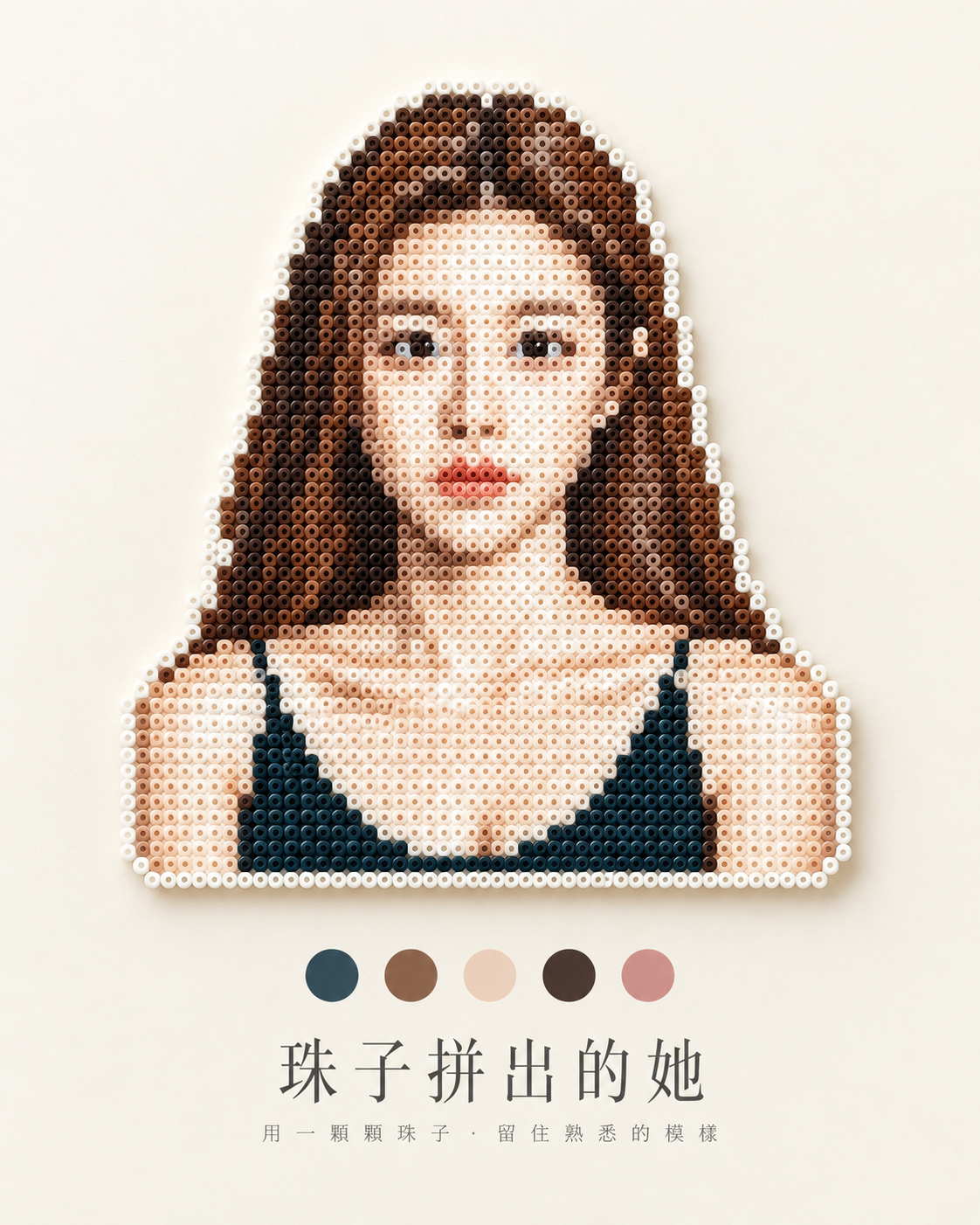
ミニマルなアイロンビーズアートの手作りポスター
Minimalist Perler Bead Art Handmade Poster Design
「ミニマルなアイロンビーズアートの手作りポスター」は gpt-image-2.5 を使用した作品です。OpenZhenZhen で元のプロンプトと生成例を確認し、創作の参考にできます。
プロンプト
中国語プロンプト
以上传图片作为主体的唯一来源,将其中的主体重新构建为真实手工拼豆(Fuse Bead / Perler Bead)作品,并呈现为克制的 4:5 编辑式静物摄影海报。保留原主体可识别的轮廓、比例、姿态、视角、标志性结构和主要配色;只简化无法在拼豆网格中清晰呈现的细小细节。不要把画面处理成普通像素滤镜或通用像素插画,不得替换、添加或臆造主体。若原图描绘人物,保留该成年人物的身份与外观,不美化、不改变年龄,并为该人物使用已配置的人物参考 ref-10a-v1;若原图没有人物,不得引入人物。 【拼豆材质】主体由许多大小一致、规则排列的圆柱形塑料拼豆构成。每颗豆都要清晰呈现拼豆特征:中央圆孔、圆柱边缘、整齐网格和颗粒间细微间隙。使用从原主体提取的有限配色表现结构、阴影和高光,并以连续的一圈米白或白色拼豆描边。成品必须像真实可触的手工制品,而非马赛克、乐高、玻璃珠、十字绣、针织品或平面像素画。 【背景与光线】将背景设为干净、温暖的奶油白哑光表面,仅保留极细腻、均匀的纹理;避免明显纸纤维、木纹和粗糙颗粒。采用精致真实的静物摄影,柔和自然光从左上方照射,呈现细腻哑光塑料质感和轻柔接触阴影。背景保持安静、低饱和。 【海报构图】无论原图比例如何,最终画面固定为 4:5 竖版极简编辑海报。完整展示主体轮廓并保持原始比例;根据横向、纵向或不规则形状自适应缩放,不拉伸、不压扁、不裁切、不出框。主体沿纵向中轴居中,位于画面中央偏上,约占画面 35%–50%,并留在充足安全边距内。上下均保留大面积负空间。 主体下方居中水平排列 3、4 或 5 个小型色卡,尺寸比例一致、间距均匀,使用从主体真实提取的主色、辅助色、深浅色或有辨识度的强调色。根据原图实际配色决定数量,绝不为凑数添加无关颜色。色卡总宽度小于主体,且仅作辅助;不使用渐变、立体效果或复杂边框。 色卡下方根据画面主体生成准确、简洁的中文主标题,以及一句极短且贴合内容的中文副标题。主标题采用轻字重、高对比宋体/明朝体风格,衬线纤细锐利、字形舒展,适度增加字距并居中;副标题明显更小、更轻,字距更宽。两行文字须清晰、正确且位于安全边距内;不得添加其他文字、标签、标志或水印。 【整体风格】拼豆手工 × 像素结构 × 色彩研究 × 极简编辑设计 × 精品静物摄影。画面安静、克制、准确、精致,如独立设计杂志中的色彩研究页面。避免彩虹配色、过大的色卡、粗黑体或卡通字体、书法、复杂文字特效、杂乱背景和过度 3D。版式顺序固定为:顶部留白、完整拼豆主体、色卡、中文主标题、极短中文副标题、底部留白。
英語プロンプト
Use the uploaded image as the sole source for the main subject. Reconstruct that subject as a real handmade fuse-bead (Perler-bead) artwork, not as an ordinary pixel filter or generic pixel illustration. Preserve its recognizable silhouette, proportions, pose, viewpoint, signature structures, and principal colors; simplify only tiny details that cannot be represented cleanly on a bead grid. Do not add, replace, or invent a subject. If the source depicts a person, preserve the depicted adult's identity and appearance without beautification or age change; use the configured human reference ref-10a-v1 for that person. If no person is depicted, do not introduce one. MATERIAL AND FORM — Build the subject from many consistently sized cylindrical plastic fuse beads in a regular grid. Make each bead legible as a bead: show its central hole, cylindrical edge, orderly spacing, and subtle gaps. Use a limited palette drawn from the source subject to render its structure, shadows, and highlights. Finish the subject with a continuous one-bead-wide outline in off-white or white. It must read as a tangible craft object, not mosaic, Lego, glass beads, cross-stitch, knitting, or flat pixel art. SETTING AND LIGHT — Place it on a clean, warm cream-white matte surface with only a very fine, even texture; exclude visible paper fibers, wood grain, and coarse particles. Photograph it as a refined real still life, with soft natural light from upper left, delicate matte-plastic highlights, and a slight soft contact shadow. Keep the background quiet and low-saturation. POSTER — Create a fixed vertical 4:5 minimalist editorial poster regardless of the reference image's aspect ratio. Preserve the subject's proportions and show its complete silhouette: adapt its scale to horizontal, vertical, or irregular shapes without stretching, compressing, cropping, or clipping. Place it centered on the vertical axis in the upper-middle area, occupying about 35–50% of the poster while remaining inside generous safe margins. Maintain large negative space above and below. Below the artwork, place a centered horizontal row of 3, 4, or 5 small, evenly spaced, equal-proportion solid-color swatches, sampled faithfully from the subject's actual main, supporting, light, dark, or distinctive accent colors. Choose the count that the source palette supports; never add filler colors. Keep the swatch row narrower than the artwork and subordinate to it; no gradients, dimensional effects, or ornate borders. Below the swatches, generate a concise Chinese headline that accurately reflects the pictured subject and a very short Chinese subtitle that suits it. Render the headline in a light-weight, high-contrast Song/Mincho-style serif with slender sharp serifs, open elegant forms, modest tracking, and centered alignment. Make the subtitle distinctly smaller and lighter with wider tracking. Keep both lines legible, correctly written, and safely within the margins; do not add other text, labels, logos, or watermarks. STYLE — Fuse-bead craft × pixel-art structure × palette study × minimalist editorial design × premium product photography. Quiet, restrained, precise, and refined, like a color-study page in an independent design magazine. Avoid rainbow palettes, oversized swatches, heavy bold or cartoon lettering, calligraphy, elaborate text effects, clutter, and excessive 3D. Maintain the top-to-bottom order: generous whitespace, complete bead subject, color swatches, Chinese headline, tiny Chinese subtitle, generous bottom whitespace.
画像・動画プロンプトをもっと見る · 画像を生成 · 動画を生成 · AI キャンバスで作成
関連作品
- オリーブグリーンの背景で木製の独楽を見つめる成人女性
「オリーブグリーンの背景で木製の独楽を見つめる成人女性」は gpt-image-2.5 を使用した作品です。OpenZhenZhen で元のプロンプトと生成例を確認し、創作の参考にできます。
- 成人女性魔法使いスクールスタイルのコスプレ直射フラッシュポートレート
「成人女性魔法使いスクールスタイルのコスプレ直射フラッシュポートレート」は gpt-image-2.5 を使用した作品です。OpenZhenZhen で元のプロンプトと生成例を確認し、創作の参考にできます。
- 成人東アジア女性AIキャラクター一貫性リファレンスシート
「成人東アジア女性AIキャラクター一貫性リファレンスシート」は gpt-image-2.5 を使用した作品です。OpenZhenZhen で元のプロンプトと生成例を確認し、創作の参考にできます。
- ネイビー制服風の都市ストリート全身ポートレート
「ネイビー制服風の都市ストリート全身ポートレート」は gpt-image-2.5 を使用した作品です。OpenZhenZhen で元のプロンプトと生成例を確認し、創作の参考にできます。
- 冷たい白い直射フラッシュの下で蝶の飾りをつけた成人女性の近景
「冷たい白い直射フラッシュの下で蝶の飾りをつけた成人女性の近景」は gpt-image-2.5 を使用した作品です。OpenZhenZhen で元のプロンプトと生成例を確認し、創作の参考にできます。
- 街角の日差しの中、リブトップスの女性の肖像
「街角の日差しの中、リブトップスの女性の肖像」は gpt-image-2.5 を使用した作品です。OpenZhenZhen で元のプロンプトと生成例を確認し、創作の参考にできます。